top of page


LOGO EVOLUTION
The initial ideas surrounding 'Shadow Productions' was a lamp which in a sinister manner flickered before illuminating our production name. This evolved all the way from torches, to lam posts, to eventually a singular light bringing the focus to our LED resembling text 'Shadow Productions'
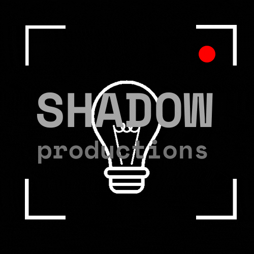
TOP TWO LOGO SELECTIONS
INITIAL LOGO IDEAS

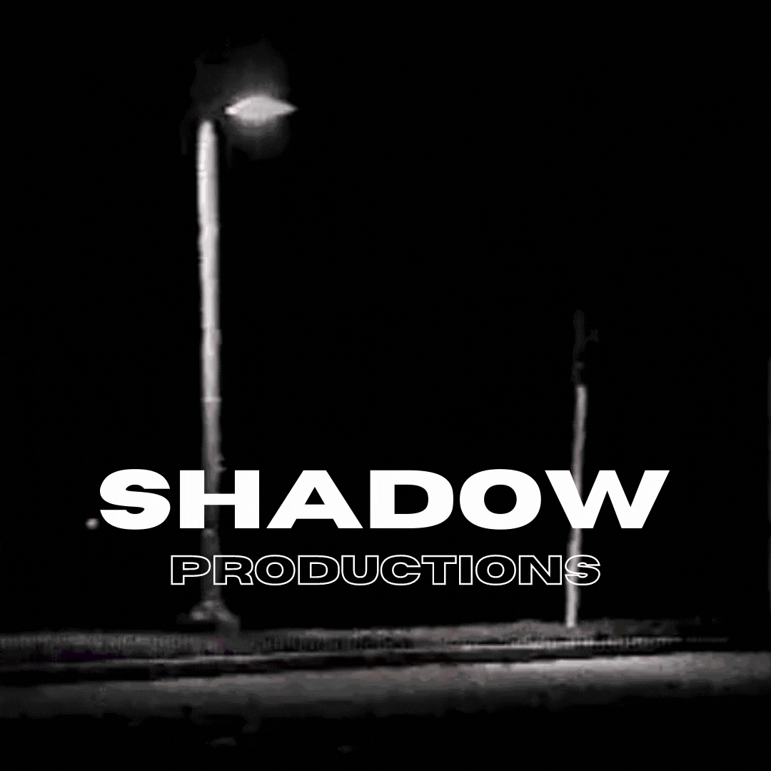


Through the production of our logo we wanted to keep one clear idea flowing through each individual logo. This was the idea that physical shadows could be displayed in the logo itself whether it was from a torch, lap or even a street light. The top two logos how initial ideas whereas the bottom two are our winning logos as they connotes ideas of mystery in the shadows and darkness, eventually lighting up our production name
'SHADOW PRODUCTIONS'

LOGO REASERCH/INSPORATION
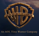


This is the evolution of the Warner Brothers logo in the hit blockbuster franchise Harry Potter.
as each movie gets more sinister you can see the logo evolving with it which is the same idea we tried to mimic through the evolution of the shadow productions logo.

FINAL PRODUCT IN THE LAST FILM
bottom of page